Feb 27, 2019

Going Mondo!


One of the best things about doing the Learning Through Inspiration series is that it focused my attention on my current stash.**  So once again I found myself looking though my supplies. I wanted a big bold design and remembered this fantastic image by Julie Ebersole -- Mondo Magnolia.

Looks "simple" doesn't it? Stamp the image with a nice dark black ink (Versafine Onyx did the trick) and add a gold glitter paper die cut (from Flora & Fauna) sentiment. I love how it turned out! But lest you think it's "simple" -- this is the 6th card I made with this set. The first 5 are works in progress or in the trash! HA

MOOD WHEN DONE:  Happy with the card!

It's cool and gray today. We've had a lot of gray days this winter. When the sun comes out I look around and soak it in. Every bit of sun enjoyed yesterday helps with the gray days today. There's a lesson there!

** oh that doesn't mean I've stopped looking or buying (but not too much).


Feb 20, 2019

Altenew Alcohol Markers: A Review

Disclosure: I have no affiliation with Altenew and paid full price for the alcohol markers.

Source: Altenew Shop
Many years ago I bought some Copic markers and haven't had a great experience. Initially, some of the markers I bought were dry out of the box and I didn't realize it. I thought that was how they were and I could not understand the rave reviews and beautiful results I was seeing online. It took me about a year to figure out that a few of them, including the colorless one, were bone dry (no genius here).

After I reinked the dry ones, I eventually realized that the ones I had didn't match or blend well. I had made the mistake of thinking that if the numbers were near each other, they would be a perfect blend. Sandy Allnock, a supremely talented artist, has a wonderful hex chart available that shows which Copic colors work together. You can buy the chart already filled in or fill in a blank chart with your own markers. I realized when I filled in my chart that almost none of my colors were near each other. If I was going to use my Copics, I would need to buy a lot more of them.

Then Altenew came out with alcohol markers, and I decided to give them a try. I have what Altenew calls Sets A and B.

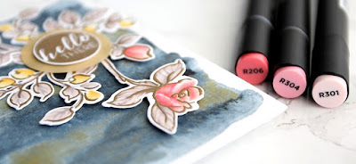
WHAT I LIKE ABOUT  THE ALTENEW ARTIST MARKERS
  • They come with two tips -- the brush tip that Copic markers have and a small bullet tip. The small bullet tip is more useful to me than the chisel tip that Copic markers have.
  • They come in sets designed to be used together. The markers are the same colors as their inks (although because they are alcohol based, not water based, not all of them are an exact match to their dye inks). I have many of the Altenew inks and love their colors.
  • Altenew has a free printable chart of its markers, so when it is time to use the markers, I just refer to the chart.
  • I love that Altenew has done the work for me. 
  • They are triangle shape and comfortable to hold and won't roll off the table.
  • The top and bottoms of the markers have the true color on them as well as the number.
  • Altenew also sells alcohol ink refills and refill brush tips. I refilled one marker and found it easy to do.
  • The refill bottles stand up and are easy to store.
  • I'm not an alcohol ink pro -- I don't need tons of colors, just ones that work together.
WHAT I DON'T LIKE ABOUT THE ALTENEW ARTIST MARKERS
  • They are black and the color names are on small black labels and can be hard to see.
  • It is hard to pull off the tops. I'm hoping this gets easier as I use them. 
  • You can buy them singly or in sets. Some of the sets include duplicates of others. It can be confusing, so just be careful.
  • The packaging is beautiful, but a bit wasteful. For example, each refill bottle is shrink wrapped in plastic, which is excellent. However, the bottle comes in a lovely printed box and that box is also wrapped in plastic. Most people will throw out the box and of course, both plastic wrappers. Would love to see all companies pare down on wrapping as much as possible. 
Bottom Line:  Would I buy these again? YES. I love these markers and hope to purchase more colors. I use them along with my Copics but will not replace my Copics as they dry out.


Feb 19, 2019

Learning Through Inspiration: Natasha Valkovskaya (Day 2)

This is part of a series of improving my cardmaking by studying other designer's cards. You can find out more about this series here.
***

Today I'm focusing on a card by Natasha that I saw on her Instagram feed. It's another beauty!! Thank you again Natasha for permitting me to post your cards on my blog.

NATASHA'S CARD


WHAT I LIKED ABOUT THIS CARD

  • Everything
  • Natasha used an acrylic block to color the top part of the card and the flowers. This creates the light open feeling that I love.
  • Black + White + One bright color = A Winner
  • The flowers are placed in a way that move your eye around the sentiment. 
MY CARD


WHAT I LEARNED
  • Still love the look created by using an acrylic block, but haven't quite mastered it. But I can mimic it by using the (no longer available) Ranger Distress Stains to color paper. It doesn't produce the same look, but I like it. Just lightly rub the dauber bottle across the paper. 
  • If I had to do it again, and I will, I'd stamp a flower off the edge. That would help with the "flow" of the images. Placing these images was difficult. I moved them around quite a bit.
  • Using the Modern Graphics dotted paper designed by Julie Ebersole adds to the interest of this card. I was surprised that this patterned paper could handle some Distress Stain. Love it!
  • I had been browsing floral sets, feeling like I had "none." Turns out I have more than none floral sets! 
My supplies: Altenew Bamboo Rose stamp set; Modern Graphics paper; Versafine Onyx ink; Mermaid Lagoon Ranger Distress Stain; detail scissors; foam tape.

MOOD WHEN DONE: Happy! 

I'll be taking a break from this Learning Through Inspiration series and will be posting other cards, but I'll be returning to it in a bit. Very gratified by the response to the series. I read every comment and am putting together a blog post just on the comments I've received here on the blog, as well as on Instagram, Facebook, and privately.

Thanks!

Feb 15, 2019

Learning Through Inspiration: Natasha Valkovskaya (Day 1)

This is part of a series on improving my cardmaking by studying other designers' cards. You can find more about the series here.

Today I'm beginning a few days focusing on the marvelously talented Natasha Valkovskaya. I found Natasha on Instagram, where she goes by the name of Craft Away With Me. That is also the name of her blog.

I selected Natasha because her cards have a fair amount of white space and I love how she adds painted backgrounds. I'm a huge fan of everything she makes. She does design work for Pinkfresh Studio, which is one of my favorite companies.

NATASHA'S CARD


WHAT I LIKED ABOUT THIS CARD
  • This is my favorite type of card -- paper, ink, and a stamp.
  • The watercoloring is gorgeous -- lots of variation and pairs perfectly with the script style font of the sentiment. Natasha explained in this post that she used an acrylic block to stamp the ink on the side of the card. Came out fantastic!
  • The gold speckles integrate the gold sentiment with the border of color.
  • LOVE the font and size of the sentiment. You can find that Pinkfresh Studio set here.
  • The simplicity of this card is very appealing. Painting a border, adding some speckles, and embossing a sentiment? No embellishments?  This is my kind of card; I can do this.
MY CARD


WHAT I LEARNED
  • I cannot "do this."
  • Natasha's card is deceptively "simple." I tried Distress Oxide inks, Distress inks; watercolors; and 2 kinds of watercolor markers (there were other efforts that didn't make it into the picture.) I tried direct to paper, watercolor brushes, and an acrylic block. A lot of watercolor paper died in this effort.
  • The biggest lesson here is to know my strengths and weaknesses. As much as I would love to be able to make Natasha's card, it's not a skill I have, at least not today. Before I buy that sentiment set I better have another use in mind. 
  • I'm never going to make light and airy cards like Julie Ebersole, color or draw like Sandy Allnock, or create little beauties the same way Lisa Spangler does. Since hope is eternal, I've had to relearn this lesson several times. 
  • The best way to cope with my weaknesses is to work on them if is important to me, and/or focus on my strengths.  
  • I don't need to be able to make this particular card to enjoy stamping. There's plenty of other techniques and styles that I can do.
MOOD WHEN DONE:  The past few weeks of studying other people's cards has been a lot of fun. As frustrating as it was not to be able to recreate Natasha's card, it was a very good learning experience.


Feb 13, 2019

Learning Through Inspiration: Laura Bassen (Day 3)

This post is part of a series on improving my cardmaking by studying other designers' cards. You can read more about it here.

Today I'm back learning more from Laura Bassen a/k/a The Rainbow Queen.

LAURA'S CARD


WHAT I LIKED ABOUT LAURA'S CARD
  • I focused on the card on the left (although that critter is pretty cute.) My favorite thing about this card is the combination of a rainbow color scheme with a lot of white.
  • There aren't any difficult techniques.
  • Every element is perfectly laid out -- it's crisp, clean, and perfectly straight.
  • Laura's rainbow starts and ends with the purple strips, but the other colors aren't repeated. And, it looks like the darkest purples are a bit smaller than the other colors. There's a lesson there on helping the eye focus on the tree by having the purples as bookends. At least I think so!
MY CARD


WHAT I LEARNED
  • One of the best ways to learn through inspiration is to take the time to identify the underlying elements in a card that I like, and then take those elements and make a card with them. The elements I identified in this card were the rainbow and white combination. I could have chosen stripes and trees, rainbows and trees, color peeking out from a detail die, etc., but I wanted to focus on the rainbow colors with a lot of white.
  • Rather than try and copy the card, this time I decided to just let my thoughts go. 
  • I had been thinking about a gorgeous new gerbera daisy stamp by Julie Ebersole. What if I bought it and painted it rainbow style? That would have taken time and, like most stampers, I was in a hurry! What else did I have? I had Julie's beautiful Mondo Hydrangea stamp. 
  • Trying to be creative or original has been a huge waste of my time and supplies, as it actually ended up quashing my creativity. I'm not sure whether it was the fear of being accused of copying someone else's ideas or the feeling that it would be boring to get my ideas from another cardmaker. In any event, I'm done with those thoughts. 
  • Colored the image using a technique I learned from Yana Smakula and mentioned earlier -- stamp with a light ink that is alcohol friendly (I used a pale pink Memento), leave the stamp in your MISTI or other stamp positioner, color with alcohol markers, and then restamp with Versamark and emboss. 
  • If I had to do it over again, I'd choose a skinnier sentiment as this one covers up the central red flower more than I like. 
My supplies:  Essentials by Ellen Mondo Hydrangea stamp and die designed by Julie Ebersole; Altenew alcohol and Copic markers (two each for red, yellow, orange, green, and purple); Wow Bright White Superfine embossing powder; Essentials by Ellen white linen cardstock; foam tape; black cardstock; Simply White Crystal Glossy White Nuvo drops; Versamark. 

MOOD WHEN DONE: This was the most valuable of the lessons since I started this series. The process of how to use another card (or any design) as inspiration without copying it too much was a lightbulb moment for me. Whether you like this card or not, if you are looking to take your cards up a notch, try out this process. Would love to know if it is helpful for you.

I'll be back (next week) with cards inspired by another card maker who I found on Instagram. She's wonderful! 

And in completely unrelated news, I was rejected for the clinical trial of a drug to treat my heart condition. You have to meet certain criteria and my numbers on one test were off by a bit. So frustrating that I cried.

However, I have a good lead on a volunteer opportunity and hope that works out. I mean I just can't stamp all day, can I?

Feb 11, 2019

Learning Through Inspiration: Follow Through

This post is part of a series on improving my card making by studying other designers' cards. You can find more about it here.

YANA AND LAURA

As you can see, this post differs from my previous posts in this series. I'm not focusing on particular cards by Yana Smakula and Laura Bassen. Rather, I decided to make a card incorporating some of the lessons I'm learning (it's an ongoing process) by studying their cards. 

Yana often makes her own backgrounds and pops up a variety of sentiments on one card. Laura blends ink beautifully, often repeats an element for a background, and uses white on black sentiments. So I used those techniques/ideas to make this card. 


I colored 3 alcohol markers onto white cardstock. I could have blended inks or used watercolors, but I wanted to try the alcohol markers. Unfortunately, my lightest marker ran out of ink and the middle one was on the way to doing so. Therefore, I got more of a striped effect, rather than a blend, but there is no blending police on duty here today so I used the hearts anyway.

WHAT I LEARNED MAKING THIS CARD
  • Not surprisingly, its harder to come up with my own design than to rely on someone else's. Design is a skill. Some have a natural eye; others don't and need to practice (and some of us apparently need to practice for years. HA). 
  • Next time I'll lay out all the hearts before I start adhering any of them. I could have spaced them better.
  • I'll make sure my markers are good and juicy before doing this again (need to buy some refills.)
  • I added the sequins after I put together the photo. The card was missing something in the lower right. I felt it needed another sentiment, but I added a few sequins instead. Again, I should have laid out all the hearts and all the sentiments first. Didn't I already learn this lesson 700 cards ago?
  • Whether relying heavily on someone else's design or making my own, stamping is still fun and relaxing. 
My supplies:

The heart die and the sentiments are from The Stamp Market (sentiment set was a free with purchase and I don't see it on the shop yet.); Altenew Alcohol Markers (Frosty Pink, Coral Berry, and Ruby Red); Essentials by Ellen white linen cardstock (it's very white and a favorite for card bases); black cardstock; Wow Bright White Superfine Embossing powder; foam tape.

MOOD WHEN DONE:  Once again I am reminded of how fantastic it is to have a hobby I love. 

Feb 8, 2019

Learning Through Inspiration: Laura Bassen (Day Two)


This is part of a series on improving my card making by studying other designers' cards. If you're unfamiliar with this series, you can find more about it here.

LAURA'S CARD


You can find Laura's blog post and video on making this beautiful card, and another one, on the Simon Says Stamp blog here

WHAT I LIKED ABOUT LAURA'S CARD
  • I wanted to try and recreate a card made by Laura so I needed a card that included products that I already had (or something similar). I have 2 sets of hexagon dies (don't ask) and I really wanted to use them. 
  • Making cards is about design + execution. I wanted to take design out of the equation and work just on execution. Could I make a geometric card that was as precise as Laura's? I have hexagon dies and some sentiment dies so I figured this would be a good card to try and recreate. 
  • Laura tucked that white on black sentiment strip right under the large script hello.
  • I liked the color combination. In her video, Laura discussed using colors that were new to her.  I'll get to those colors below.
MY CARD


WHAT I LEARNED
  • Making a copy, or almost copy, of someone else's card helped me focus on techniques -- blending, placing those hexagons, etc. Very valuable experience!
  • If Laura did not make a video showing how she made her card, I'd charge her with fake card making! HA! Laura used Press'n Seal. She laid out the hexagons, covered them with the Press'n Seal, placed the pieces of foam tape on each hexagon, and then picked up all the hexagons at once. It worked like a charm. 
  • Since it looked so easy, I went out and bought some Press'n Seal. I laid out the hexagons, and as soon as I put the Press'n Seal over them, the hexagons flew all over. I guess it was some type of static cling effect. 
  • I laid out the hexagons again, and this time, no they did not leap up, but the hexagons did not stick to the wrap.
  • So I laid out the hexagons again, and put the Press'n Seal over them. But this time I rubbed the plastic wrap over each hexagon with the end of a paintbrush handle, sealing the wrap to the hexagons. This worked. However, I forgot to put the foam tape on each hexagon, so after I placed them on the card and lifted up the Press'n Seal, they flew all over. Again.
  • Clearly operator error -- I'm going to master Press'n Seal one of these days. However, I ended up hand placing each hexagon one by one, and was happy with the result.
  • Laura used a narrower sentiment. I love the one I used, but it looks a bit too wide for a portrait shaped card. The"hello" die Laura used looks better, and the placement of her sentiment below fits better. I'll be more careful next time to pick a sentiment die that is more proportional and an additional sentiment that fits a bit better. 
  • If I remake the card, I'd lower the "Many Thanks" sentiment just a bit.
  • Laura explained in her video that she purposely used a different color palette. While I don't have the Distress Oxide colors that she used, I tried a bunch of different green/blue combinations and they didn't work out as I don't have enough of a range of colors from light to dark. Even with the card I made, I wish I used colors with a bit more contrast. I'll keep that in mind the next time I blend a variety of colors on a piece of cardstock.
My supplies:

Little B hexagon dies; Distress Oxide inks (Picked Raspberry, Abandoned Coral, and Fossilized Amber); Essentials by Ellen Many Thanks die (appears to be retired); Altenew Many Thanks set (used part of a sentiment); white and black card stocks, foam tape; and Wow Bright White Superfine Embossing Powder.

MOOD WHEN DONE: Happy! I enjoyed making this card and pretty much like how it came out. It took forever to make because of the mistakes I made, and because I was interrupted by participating in the clinical trial of a drug that I mentioned before. Yesterday I learned that I may not be able to participate in the trial -- basically your heart has to meet certain criteria and mine is off by a few points on one test. Frustrating! I'll know for sure next week. 

Feb 4, 2019

Learning Through Inspiration: Laura Bassen (Day One)

This is part of a series on improving my card making by studying other designers' cards. If you're unfamiliar with this series, you can learn more about it here.

* * *

Today I'm introducing some lessons learned by studying Laura Bassen a/k/a Laurafadora. Thank you, Laura, for permitting me to post your gorgeous cards on my blog and for making such a great contribution to the stamping community.

Laura's work is instantly recognizable -- she's the queen of rainbow coloring, ink blending, precise geometrics, and cute critters. She designs for Simon Says Stamp, Pinkfresh Studio, Mama Elephant, and others. If I owned a stamp company, I'd hire her to design all the stamps and all the samples and then I'd sit back and count my money!

I had the pleasure of interviewing Laura for this blog. You can read that interview here. (It's been 3 years? Wow.) One of the things that impressed me when I was talking with Laura is her dedication to the craft. Laura is relaxed and funny in her videos, but card making is her job and she's not messing around. 

LAURA'S CARDS


WHAT I LIKED ABOUT LAURA'S CARDS
  • Color! Laura's colors are bright and beautiful. 
  • White on black sentiment. Laura uses this often, and helps those bright colors pop even more.
  • Laura's cards are perfectly constructed and spaced -- everything is in the right place and her embellishments do what they are supposed to -- add to the beauty and not distract.
  • Chose these particular cards to begin with because they did not involve tricky placement of geometric images (that's coming!).
MY CARD


WHAT I LEARNED
  • Laura's cards look easy to make. They are not, and this isn't fawning. Seriously, this was the 5th card I made! I don't have a lot of colored cardstock, so I couldn't make a rainbow with cardstock and my watercolored attempt(s) didn't work out. 
  • Ink blending is hard to do well, but a cover plate hides the mess underneath.
  • Rainbow + white on black sentiment + sparkle is a winner. 
  • Details matter. I have one cover plate and it is exactly an A2 size. I die cut one layer and then die cut a second with fun foam. It was hard to line them up as the foam is flexible. I should have trimmed the edges of the die cut foam slightly before adhering the top layer. I ended up having to do it by hand and it's not perfect.
  • Using a T-Square ruler helps ensure that the sentiment is straight.  
  • However, using a ruler does not prevent stupid mistakes. I adhered the cover plate upside down (I wanted the red/orange/yellow on the top.) Slow down.
  • I want more cover plates! I want more colored cardstock! I want every thing Laura uses. However, there's a hard limit on what I will buy now, and it's fun to make do without -- sometimes.
My supplies:

Essentials by Ellen Bed of Roses Cover Plate; Distress Oxide Inks; Altenew Layered Cupcake (sentiment); White Linen cardstock from Ellen Hutson; black cardstock; Wow Bright White Superfine Embossing Powder; foam; foam tape; clear sequins. 

MOOD WHEN DONE:  I'm delighted with this card. It is fun to look at and was fun to make and give to a friend. 

I'll be back with more lessons from studying Laura, hopefully later this week. I have 4 medical appointments coming up this week, almost all related to the clinical trial in which I am participating. I am so grateful that I have this opportunity to try and find a drug to help people avoid the heart surgery I had, but going back and forth for these appointments is time consuming and messing with my crafting!